
I can’t stop walking in here and just staring. I have so much to say about it, so bare with me. If you just scroll through the pix, I don’t blame you. But if you care to hear stories or info behind certain things in the room, read on! To see my initial plans for this room, click HERE. To hear the woes of choosing paint color for it, click HERE. To read about my decision-making process for keeping original hardware to the thrifted buffet, click HERE. And to get a DIY tutorial for painting it, click HERE. Ok, now that you’re caught up, here’s a reminder of what the room looked like BEFORE… I call this the “Nice, But Not Me” dining room:

And here it is now! I call this, “Regal Funk.” Lol!


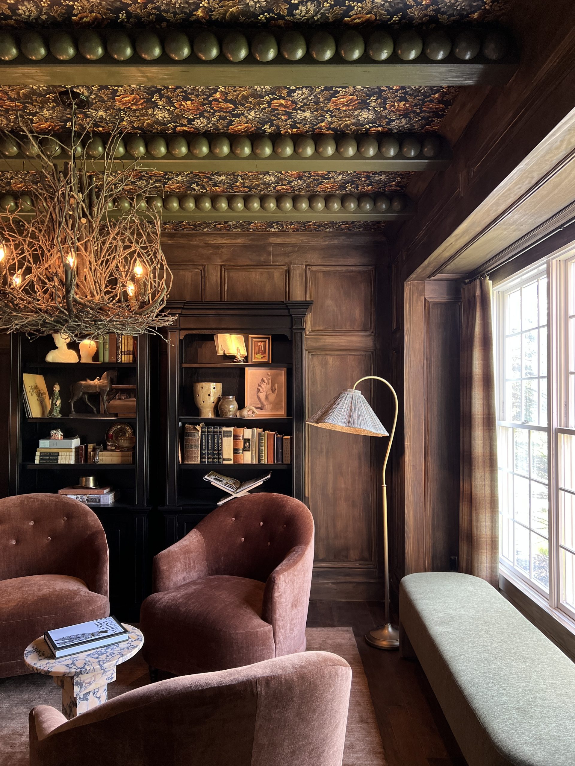
Ok, so how do I explain my thought process behind this room? Let me start by saying, I have an art degree. Art History was always one of my favorite courses, and walking through a museum is my happy place. So much so that I was married in this room at The Toledo Museum of Art…

Perhaps my love for the arts goes back to watching Bob Ross with my dad as a kid. Who knows? But it’s a part of me. The gallery wall in my new dining room is a mix of old Rennaisance prints I found on www.art.com and fun thrift and antique finds. Except for the Michigan map on canvas- can you believe I found that at Home Goods? Got a big thumbs up for that from my hubbie. Go Blue! Stay tuned for a blog post on any stories I have about my finds, the costs, and how I threw it all together. I’ve had people say to me, “I don’t know how to go about choosing art.” One example that someone gave me is that they may see a painting of a horse that they love, but then they don’t want to buy it because they have no connection to horses. It cracks me up. Buy what puts a smile on your face when you look at it! You don’t have to have ever ridden a horse in order to have a painting of a horse in your house. That is the most random example, but I’m just trying to drive home the point that art is subjective, and when it comes down to it, something that should make you happy.


The walls are Sherwin Williams Urbane Bronze. I had gone from wanting the walls light grey to wanting the walls black. This warm dark charcoal was the perfect shade in between. Dark was definitely the way to go for the look I was going for, but I felt like black was a bit too stark. Eventually I may do a ceiling treatment, or maybe paint the medallion.
Let’s talk about the infamous Anthropologie wallpaper. I think you either love it or you hate it. I’ve been drawn to regal interiors that have a museum feel, but I also like an element of fun and “unstuffiness,” if you will. I have four kids- nothing is stuffy about my home. If it seems stuffy- come on over. You’ll get a closer look at crayon marks on walls, finger prints on windows, juice box spills on the carpet, and race car scratches on tables. This wallpaper screams “fun” to me, and I like that it balances out the formality that’s going on over on the gallery wall. So does the silliness of stacking books under those lamps. I had a moment of “Is this innovative or stupid?” and decided to just roll with it. I love the lamps but they needed more height; so there you have it. The books were 25 cents each at a thrift shop, except for the one under the bust- that one was an antique for $10 . (It dates back to 1891 and it’s extra beautiful:)


The styling on the buffet is a mix of entertaining servingware. The antique espresso cups I stole from my parents’ house:) Thanks, Mom! She’s used to me coming over and saying, “Is there something in your attic you think I might like?” I think they look beautiful on this green buffet. I can’t believe we never had a buffet in here. So many possibilities for the holidays! I can’t wait!
I struggled with what to do for a centerpiece on the table. I think centerpieces can be inimidating! Mainly because there are a million directions to go in. In the end, I thought a simple collection of candlesticks did the trick. The two on the ends were 50 cents each at a thrift store. (You can tell- they’re a dirty hot mess, but I love them anyway) The two next to those were $10 each at a thrift store. That tacky little swan guy was $3 at a thrift store. And the newer ones in the middle are from At Home. I think it’s always good to balance out a collection with old and new. And I came to the conclusion that instead of putting larger candles on the center ones, that these decorative balls would add a little more interest and color. I’m invisioning mini pumpkins on them in the fall, and perhaps ornaments on them in the winter. That’s the great thing about this- it’s diverse and easy to change.


Can we talk about the mirror? I’m not 100% sure I’m keeping it. Yikes! Insert that emoji face with the awkward stretched out smile. I had it in my original plans. I initially found it on Joss & Main, but after it sold out, I actually found it on Bed Bath & Beyond. Now that it’s hung, I’m wondering if a) the gold is a bit too orange-y compared to the rest of the gold in the room, b) if its ornate style is just too much with everything else that’s going on, and c) should I have gone with something vertical instead of horizontal? I may switch it out for something simpler. We shall see. I didn’t want to keep searching and hold off this reveal, so for now, it stays.

The pillows are from Hollie over at Stuck On Hue on Etsy and I LOVE them! Animal print is actually working as a neutral in this room, in my opinion. And the chandelier! Holy heart eyes! You should see it at night! What else? The rug! I loved the bold blue but also loved the traditional style of it. This is one room I did not want to see any geometric patterns in. The wallpaper and buffet are a little loud, so I wanted that wall to kind of stand out on its own. Which is why I also went for a solid drape. That was hard! I was originally drawn to these, but in the end decided a simple black velvet was the way to go. I didn’t want something I’d get too tired of later. I question them a little bit, because they do get a little lost in the dark walls at night, but I figured if I change my mind, I can use them in my bedroom! I found these vintage tie backs from an antique shop for $9.


Some extra pix…


I loved this antique needlepoint I found! And the mat is red velvet! So perfect!

Of course I didn’t notice the beads needed tweaking before I was photographing. Oy.


Detail on velvet dining chairs…

Speaking of dining chairs, I know my original plan included this settee, but in the end I decided it was just too tall and it was going to cover too much of the buffet area/wallpaper. Also, its nailheads were silver, and although there’s nothing wrong with mixing metals, I just wasn’t feeling it.
What’s your favorite part? Is it what you expected? Tell me your thoughts! I love your comments! I know this may not be for everybody, but it makes me so happy. And my husband likes it! Hooray! I love when he thinks I’m crazy and then gives me major kudos when I’m done with a project. #itoldyouso #happywifehappylife #trusttheartist
PRODUCT SOURCES:
Wallpaper: Anthropologie
Black velvet chairs: World Market
Tufted chairs: Home Goods
Buffet: $50 from a thrift shop, DIY
Rug: Joss & Main (sold out, but you can also find it here on Wayfair)
Table: Art Van Furniture (no longer available- this is the only thing in the room that stayed! Bought it years ago)
Chandelier: Shades of Light
Drapes: Overstock
Mirror: Bed Bath & Beyond
Lamps: Home Goods
Candlesticks: some thrifted, some from At Home
Pillows: Stuck On Hue
Michigan on canvas: Home Goods
Frames for prints: Hobby Lobby
Tray on buffet: Hobby Lobby
Green glassware: Home Goods
Bust: At Home
Blue bowls: Anthropologie
Owl: Anthropologie
Decorative balls on candlesticks: Home Goods

Man, was that long-winded! If you took the time to read all of that, THANK YOU!! 🙂 Here’s to the next project…
Cheers,
Haneen


Wonderful job searching for all those treasures and fearlessly curating a look that reminds me of the famous shop in London in the sixties…Biba…. I love how you paired your chairs in a soul train line and stacked those books with thought provoking titles!
Thank you so much! So kind of you to say!
I love the mirror! It matches the hardware on the buffet, if you need to, change the color of gold😘. The room is beautiful, a great mix of fun and traditional in strong colors🥰
Thanks so much! Stay tuned, this dining room reveal is actually from about five years ago and it’s currently being changed 🙂
Hi Haneen! I also love art and have always wanted a room filled with portraits and landscapes, but I have such a small budget. Where can I purchase art-quality, regal frames like the ones you have? Did you have your artwork professionally framed by Hobby Lobby? Your room is BEAUTIFUL.
Thank you! I only had two professionally framed at Hobby Lobby. Those pieces I found on art.com. The rest are thrifted! I love finding art at thrift stores. You can always make inexpensive prints look more special by the frames you select.
That’s my favorite room at the Toledo Museum of Art as well!! I was scrolling through your post, I saw the pic, and immediately was like hey, I know that place! So cool! Great room, love the rug!
Thank you so much!!
This room makes me smile and very happy! Love every bit of it that it is difficult to choose a “favorite” part! With that said I think I’m leaning most towards the flower wallpaper wall with the beautiful buffet! I really think the mirror works better than, say, a taller one, and the orangish gold looks fantastic to me! I’m from Michigan, so of course I’m digging the that wall hanging! As far as I can see, the only change I (might) make (which I’m not at all too sure I would either), is making the drapes a shade of one of the reddish flowers in the wallpaper, but still a velvet fabric.
A few months ago at a thrift store I was being wishy washy about an item (because we are try to downsize our “stuff” at home), and my husband told me to do what the Japanese do, “hold said item and if it brings you joy, keep it, if not get rid of it”. Needless to say, I bought it!
I so love this room! Thank you for being so kind as to share your talents with all of us!🥰
Thank you so much! This room was actually completely redone last fall 🙂
Hello Haneen, first I’ll say your name is simply beautiful! But the room….there are no words to describe how amazing it is! I love the boldness…..my style as well, plus it’s inviting and has endless possibilities for holiday decorating! Fantastic job and you can feel comfortable and confident that you will not have to change a thing for years.
That’s so incredibly kind of you! Thanks so much!
OMG,Haneen!! I am blown away. I absolutely love everything! I’m working on a wildly colorful kitchen for my Trinidadian mother and it’s been an amazing journey. I, also, found some beautiful wallpaper from Anthro a few months ago and can’t wait to install. Ok, and do not get rid of that mirror. It’s perfect ties nicely with the gallery wall! I would raise it a touch, though, to balance the space above and below the mirror (considering the items on the tray vs the buffet height.) The lamp height is great and books are awesome…as is the swan! Thank you for your inspiration! It can be scary to go bold but seeing this room is such a boost and a joy!
Your Buffet is abdolutely stunning, the colour Evrrything about it … Will be on the hunt here in Ireland to find something like it.. Did you paint it the fabulous colour after you bought it?
Thank you so much! I painted it this color! It’s BM Mediterranean Olive (same as the walls)
What color did you paint the buffet? I looked for the BM Mediterranean Olive and the color doesn’t match. I adore that color and everything you did with this room!! Perfect inspiration for my new house!
The buffet in the “before” is BM Chrome Green. The “after” is Mediterranean Olive 🙂