
Ok, so here’s the thing. I spent days analyzing grey paint samples for my dining room makeover. It’s way harder than you may think. Some greys look too blue, too lavender, too pink, too tan, too yellow, etc etc etc.


I narrowed it down to Intellectual Gray by Sherwin Williams, spent a few days painting it, and questioned it the entire time. I’m usually WAY more decisive. I know what I like, but for some reason I’ve struggled with this. I’m trying so hard to make it light, airy and neutral, so that the main pop can be this killer wallpaper from Anthropolgie. I think I’m having such a hard time because the images I’ve been drawn to on Pinterest have such a deeper, richer, more saturated look.

Image from Traditional Home

Image from Apartment Therapy

Image from Apartment Therapy

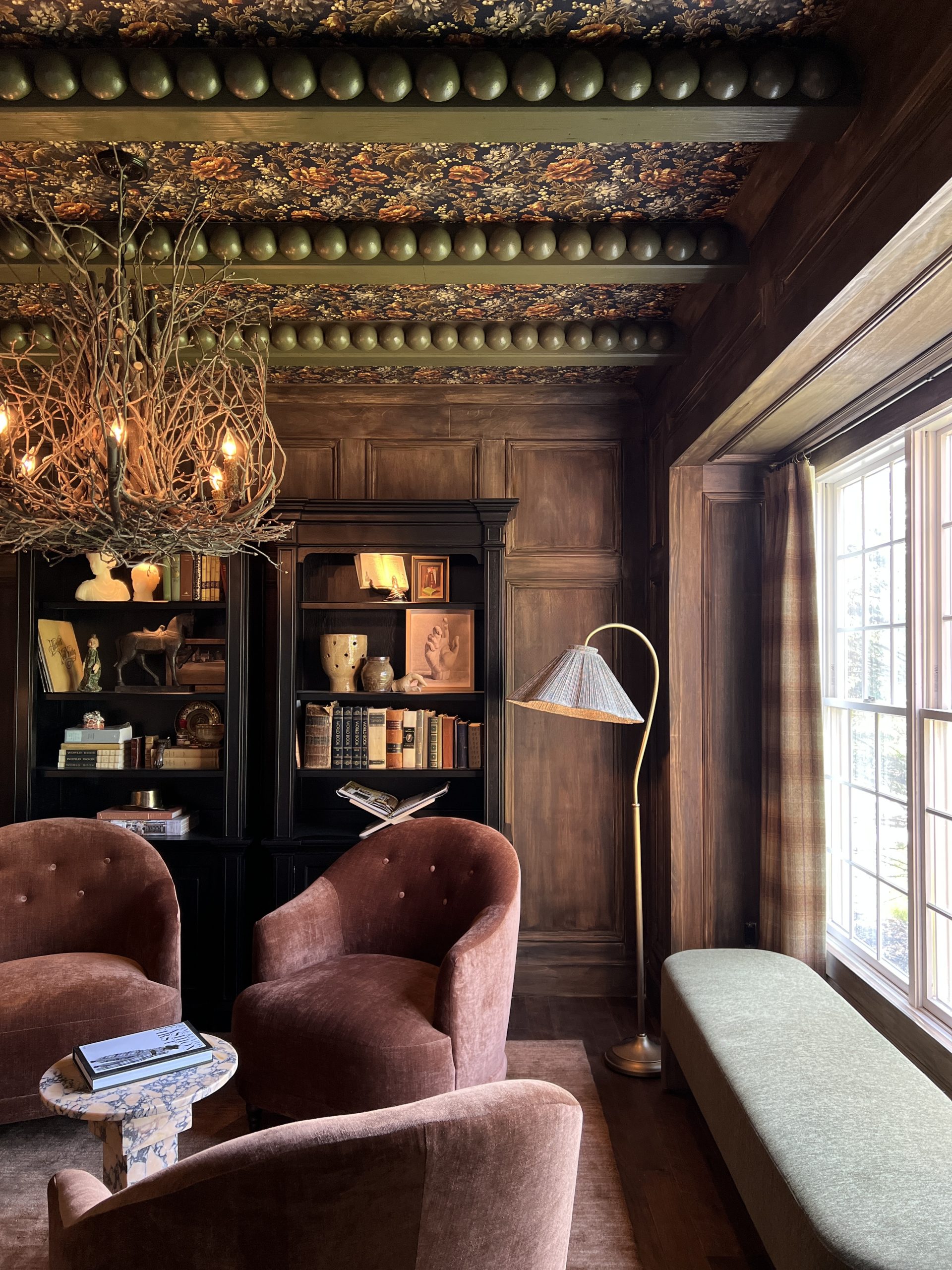
Image from Design Sponge

Image from Design Sponge

Image from Apartment Therapy

Image from BelleMaison23
Another thing that I’ve really come to want in the dining room, is a “museum” feel. I love the look of old paintings in ornate gold frames! Like this…

Image from Primitive Modernism
The problem is, I find this look to be most impactful against dark walls. My head has been spinning about this- so much so, that even on my daughter’s field trip to the Detroit Institue of Art, I found myself studying the paintings and the color of the walls they were on…
Gold on grey:

Gold on navy:

I may have heard, “Mom, get off your phone” at this point. Mom of the Year, right here! So here’s what it boils down to. I finished painting the room, and this was the result:

Not sold. I just was NOT sold. Perhaps it’s because not everything is in place. The indigo rug hasn’t arrived, the new black beaded light fixture isn’t hung, the black velvet chairs aren’t at the table. But I still had these questions in my head when I took a step back: 1) Is this looking like a little girl’s bedroom? 2) Who am I trying to please? 3) Does this make sense opposite my brown living room on the other side of the foyer????
In regards to question 1, I found myself reading the grey as a pastel. Pair that with floral wallpaper and my brain just went “little girl.” Ah! NOT the look I was going for. Something deeper would create more of a “mood.” I’ve realized that about myself when it comes to interior design. I like each room to set a “mood.” And when I say I want a room to be moody, I’m not saying it needs to be serious. But I do think a dining room can handle a little sass.
Question 2…. hmmm, who am I pleasing? Well, grey is HUGE right now, so I can’t lie and say I wasn’t partially persuaded by the world of Instagram to go “light and airy.” But more importantly, I’m trying to keep my husband in mind to be honest with you. Surely, this was not his ideal wallpaper choice. Lol. The least I could do was simmer down the paint choice, right? But let’s be honest, I’m not a neutral gal. And that’s nothing to be ashamed of! And obviously if I’m feeling the grey was looking like a child’s bedroom, certainly my hubby wasn’t going to like that either! So what am I doing staring at these grey walls????
Question 3… There is an unspoken design “rule” that rooms should have a sense of fluidity throughout the home. They don’t need to all be the same color, but perhaps all from the same swatch in a paint deck. I STRUGGLE WITH THIS. I love every room having its own personality! So did it look great across from the brown living room? No. The question is, “Should I change it?”

Initially, my thought was, wait til everything’s in place and re-evaluate once you see it all together. That would be the logical approach. Stick a paintbrush in my hand around midnight though, and all sense of logic goes out the window. Another thought was, maybe I could paint the ceiling black? That would add the drama I want without being too dark. Although, the room gets a ton of beautiful, natural light, so it could handle it. But when I grabbed a quart of Caviar by Sherwin Williams, I ended up going to town on a wall instead. Don’t ask me how or why, ask my paintbrush!

So here’s one black wall in all of its glory. What are your thoughts? Did you like it grey? Should I go forward with this and paint the rest black? Should I paint it back to the grey and just paint the ceiling black? And before you suggest pulling a color from the wallpaper (there’s certainly enough to choose from)- I really do want to keep the rest of the room neutral. The whole reason I was craving a change to begin with is because the pumperknickle walls that my dining room initially had always read “Autumn” to me. (You can find photos of it under “seasonal” in the menu) I don’t want a specific color to hinder whatever season I’m decorating for. So I’m keeping the main pop of color where the wallpaper is and calling it a day. So the question becomes, what shade of neutral is the way to go? Dark or Light?
If there’s anything I want you to learn from this, it’s this: It’s just paint! Try things! Go for something you wouldn’t necessarily go for! I gotta say, typically we hire out a painter, but painting it myself is so FREEING! Can’t tell you how nice it was to know that if I changed my mind, it’s no biggie! When you’re paying someone else to do it, you feel stuck.
I’d love to hear from you! Anyone else paint an entire room and then change their mind? Someone tell me I’m not cuckoo for Cocoa Puffs!
Hugs,
Haneen


Darker wall for sure!! Looks like I’m only about 7 years too late -sorry lol. What did you end up doing with the space? My wife and I are looking at this exact wallpaper and likely pairing it with a dark steely blue paint on the bottom third.